CASE STUDY:
PORTIVO
PROJECT GOAL
To improve the hassle of travel, as travel can prove to be confusing and difficult due to the numerous inconveniences, inconsistencies, and lack of accessibility that travel applications can hold.
TOPIC OVERVIEW
With the increasing scope of cultural exploration becoming more widespread, especially with influences of social media and cuisine, traveling has become an intriguing prospect for many. However, there are many types of travel apps, all utilizing different needs, layouts, and accessibility, that ultimately cause users to maneuver through a number of apps, further leading to more tedious and appealing experiences than need be. Thus, the aim of this research is to explore solutions that aid in a positive, accessible experience for those who wish to travel with ease of mind, providing a memorable, easy-to-maneuver app design that will hold the core necessities, including real-time navigational and update systems, that any consumer may need.
PROJECT EXPERIENCE
When it came to trying to maneuver around the actual aspect of what the aim and goal was for this design work, I initially focused on researching the concept of “In what ways can the usage of AI/AR qualities allow travel to be made easier and more efficient for consumers?”
RESEARCH
With this, I first created a flowchart to exemplify the potential direction a consumer would go when utilizing the app idea I had in mind. It was as follows:
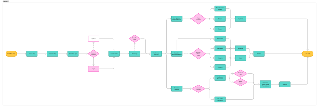
User Journey (Storytelling of the user tasking process):
S1: Mimi was traveling to a new country, Italy, for the first time.
S2: Mimi skims through apps that could help her on her journey, sees recommendations about a new travel app that had an “all-in-one” feature, and decides to go with it.
S3: As she finishes installing the app, Mimi opens the app to see the main page, allowing her to make a new account to match her preferences.
S4: Once she creates an account, Mimi is given a short questionnaire to ask for base information about her trip plans.
S5: As she finishes the questionnaire, the app organizes preferences and aims for the trip, based on input. The app then sorts the main features on the home page, all deemed most applicable to Mimi’s input, while giving small step-by-step pop ups of what each portion of the app does. She is able to understand the functions of the app instantaneously.
S6: The app then gives notifications of live scenarios for flight plans, the locations that would be interesting for her to see, and live translation features that would be usable through the camera option. She then is able to check these aspects for herself.
S7: As she goes through her flight itinerary, the issues she usually faces with boarding times get fixed due to the live updates in the app.
S8: As she lands in Italy, she is able to see recommendations of the best spots to visit based on her location and preferences.
S9: As she maneuvers around the place, not understanding the language, she is able to open her phone to the live camera option, which gives live translations. The recording option also works live through text and audio, to help her to talk to locals quickly.
S10: Mimi then flies back home with usage of the live updates once more, and she has finished her goal.
Along with that, I delved into formulating a test group to base my usability testing on, initializing more research through that of demographical and preferential inquiry.
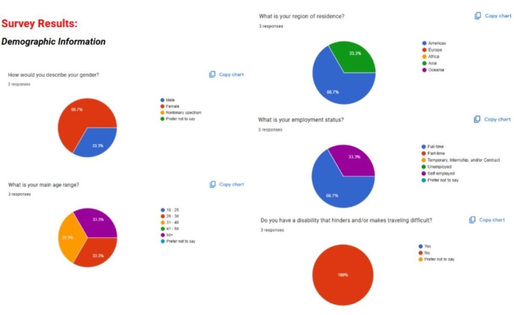
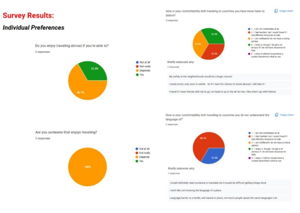
Demographical and preferential inquiry research results.
VISUAL IDENTITY
Then, I moved onto the branding aspect for this application, the branding identity layout below displaying the logo design, color palette, and used typographical aspects in the app. The logomark displays a simple arrow, with the app’s name, showcasing the concept of directivity.
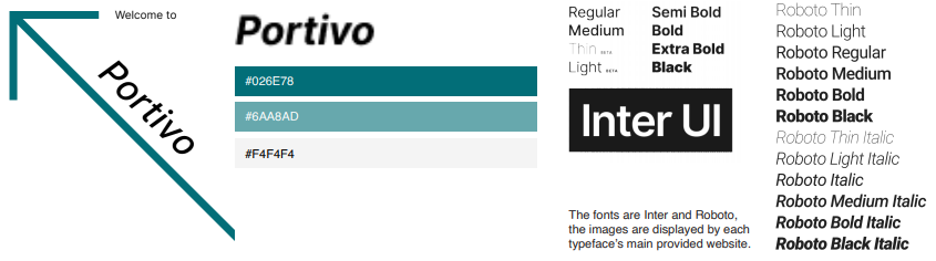
Brand Identity sheet for the app, “Portivo”.
WIREFRAMING
These high-fidelity wireframes essentially display the different maneuverability of how the travel app, Portivo, would work for a user who would find usability and usefulness from it. The app showcases features such as a questionnaire for preferences, and features that help someone find and book requests through the app, such as flights and hotel rooms. It also displays the means of the app being able to use live camera features, along with live translation tools that would further help an individual visiting a country they do not speak the language of, especially in one that they had never been to prior to their active trip.
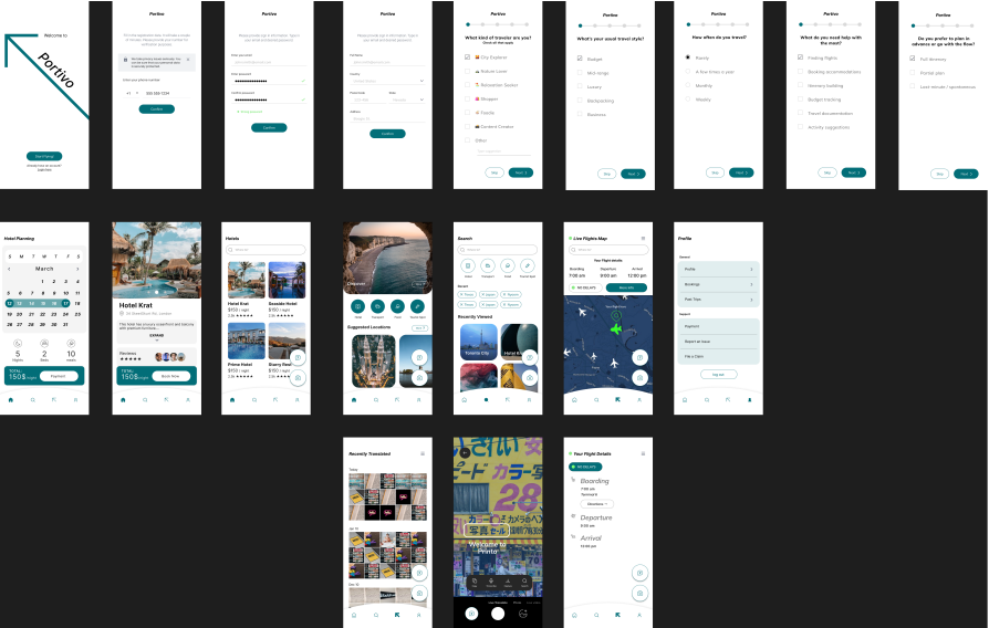
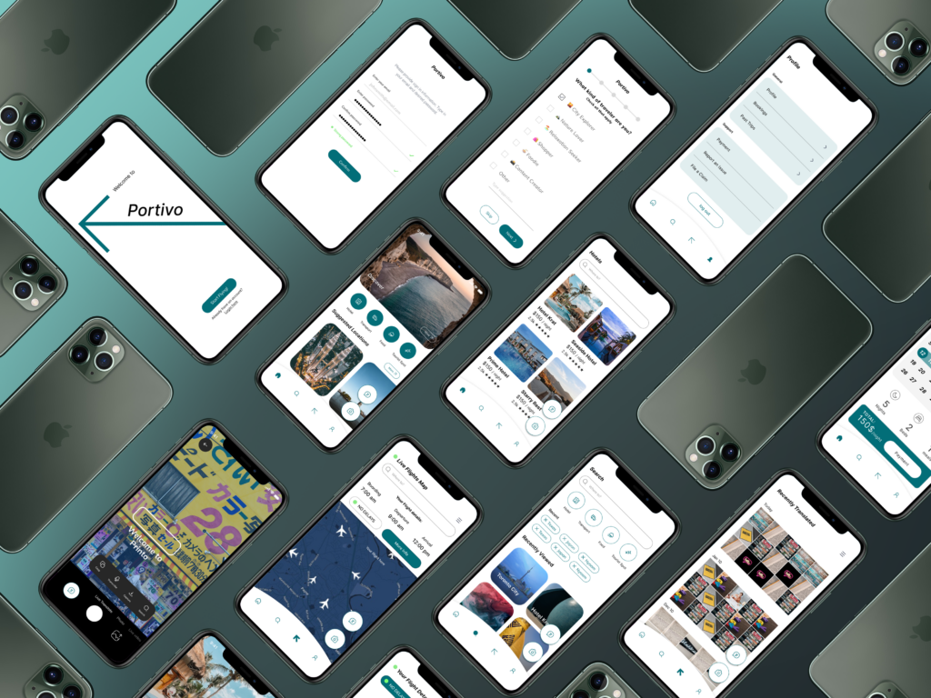
The High-Fidelity wireframing of the prototype for the app, “Portivo” (available through that of Figma).
USER TESTING
I did observations of my individuals over stream for Users #1 and #2, whereas I did it in-person with User #3, monitoring the mouse and finger movements of each of my individuals carefully while tallying physically and, ultimately, recording it after the fact in a document. From my main observations, the app was pretty maneuverable within seconds, just consisting of a few misclicks here and there as my users expected the application to run as a real, literal, application, the Figma layout just being a bit confusing, so I am not entirely sure if that had resulted in skewing my data in any way. Nonetheless, the main outcome resulted in majority of straightforward responses, though the older individual, User 3, did have a tougher time maneuvering it than those of the “younger” ages, as User #1 is between the 26 – 30 age mark, and User #2 is between the 31 – 40 age mark.
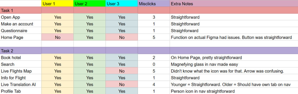
Recorded test results of maneuvering the prototype for the app, “Portivo” (available through that of Figma).
The app was also, overall seen more positively in terms of its goal of resource and reusability. The functions looked as though people approved of how they worked, at least from when I’d see the users nod to themselves or raise eyebrows at how the functions would maneuver, a surprising amount of eyebrows raised more along the aspect of the Live Translation AI feature that was displayed. Though, it also, even more surprisingly had a bit of conflicting manners based on the actual usage of AI, which I didn’t expect too heavily until User #1 had stated it.
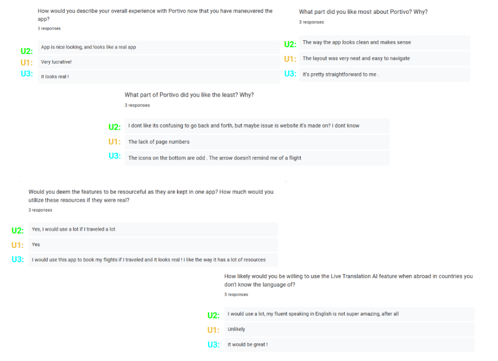
Recorded survey results of maneuvering the prototype for the app, “Portivo” (available through that of Figma).
PROJECT OUTCOME
FIGMA PROTOTYPE FINAL
In terms of the overall app, the app consensus came out as rather “neat” and “straightforward” by the different age ranges that had participated in this research study. In relation to such as well, the most each individual had taken was only a few seconds for each click, the older user in particular adding to misclicks due to them wondering if the buttons being pressed would work or not, curiosity arising at the features and functions.
For usability aspect, it seemed people favored it nonetheless, finding the fact that things people wouldn’t think as much about until being faced with the issue, such as traveling to a country where you don’t know locations or language, to be rather resourceful in the end, especially “if the app does not end up taking too much storage space” on one’s phone, which I would further make sure that, if it were an app to be used genuinely, that aspect would be kept in mind for further implementation and regard.